Pozo delivery
- Frank NGOGA
- Aug 10, 2021
- 2 min read
Updated: Oct 13, 2021
Background
Launched in Rwanda in September 2020 in Kigali, Rwanda. Pozo delivery is a delivery service product that helps deliver food with the purpose to attain remarkable customer satisfaction in that sector, they also provide express delivery services across cities in Rwanda.
The goal
To improve the way users acquire supplies via the current mobile app and also making restaurants more accessible and all that done in a very seamless ordering experience. All these improvements are to be launched as Pozo celebrates their 1st anniversary.
Role: Product Designer, Logo Designer
Date: April 2021 - June 2021
Tools: Figma, Miro, Asana
Exercises: A/B testing, UX design, UI design
The target user
The project kicked off in Kigali aiming to primarily service full-time workers as they have less time to get to restaurants for food. The second target user is anyone in the range of 20-45, tech-savvy with an interest in online shopping and deliveries.
The client also wanted to update the logo together with the app, giving the product a whole new different perception, this is how I approached the logo re-design
Logo re-design process


UX Brainstorming with the client:


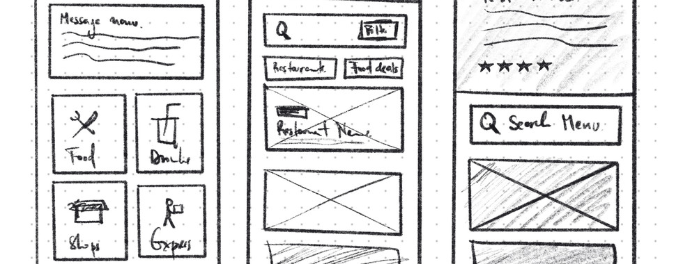
Wireframing
Quantitative survey about the experience people have with ordering food online:
This time we wanted to do it right, with the user at the center of everything we were designing, we carried out a survey with 100 different people to uncover hardships they had while ordering food online.

We also found out that a small portion of people still order food with direct calls to restaurants.

Navigation and delivery time were the biggest issues people were facing, this is why we took our time and simplified Pozo's navigation, we removed unnecessary steps and information that most people did not find necessary.
High fidelity mockups


Client after using the prototype


Comments